In the previous post in this series, Is Ukraine-Russia War Entering the End Game?, my conclusion was that Ukraine was on track to losing the war, as predicted by the attritional model that I had developed for this conflict, but with a qualifier:
Ukraine is like a steam engine with internal pressures building up. But it is impossible to make an accurate forecast on when things blow up.
However, since I published it (on May 20 of this year), there has been a veritable deluge of reports and opinions in the mainstream press claiming the opposite - that it is Russia that's on its last legs and about to suffer a defeat.
An article in the New York Times, citing a CSIS study, Russian Blood and Treasure: The Ballooning Costs of Putin's War, states
The study said that in 2026, Russia's monthly casualty rates of 30,000 to 34,000 probably exceeded its recruitment rates of about 27,000 new recruits per month.
The CSIS report expands on this as follows:
Russian battlefield casualties and fatalities are significantly greater than Ukrainian casualties and fatalities. For much of the war, the Russia-Ukraine casualty ratio was between 2:1 and 3:1 (between two and three Russian casualties for every one Ukrainian casualty), though the rate has likely risen to nearly 8:1 in the first half of 2026. Ukrainian forces have suffered somewhere between 525,000 and 625,000 casualties (killed, wounded, and missing) and between 125,000 and 150,000 fatalities between February 2022 and June 2026.
According to a recent report by Seymour Hirsch, Putin's Predicament after the Tide Turned in Ukraine, there is a growing sentiment in Washington that because of "Ukraine's growing military success" Russian President Putin ""is in a no-win situation."
On the other hand, the American critics of the US "endless" wars, such as Larry Johnson, John Mearsheimer, and Daniel Davis, dismiss these reports as a part of the joint Ukrainian/NATO "psyop" (psychological operation). For example, Larry Johnson in his July 1 post, The NY Times Lies About Russian and Ukrainian Casualties, pointed out that these estimates of catastrophic Russian losses are not credible, because of great disparities in artillery fires and FAB glide bombs, as well as Russia catching up to Ukraine in drone use.
Tracing the source of these recent estimates of Russian casualties, we see that the CSIS study, cited by the NYT, based its assessment on "CSIS estimates; UK Ministry of Defense; analysis of data collected by Russian news outlet Mediazona and the BBC Russian Service; and interviews with U.S., European, Ukrainian, and other government officials."
Institute for the Study of War, in its Russian Offensive Campaign Assessments, regularly publishes similar reports of 30,000-40,000 Russian casualties per month. For example, according to ISW, Russian forces suffered 39,490 casualties in June 2026. The source ? Ukrainian General Staff. But if the current wave of reports in the mainstream media about Russia's impending defeat is a psyop, then Ukrainian General Staff is the last source we should believe (equally as with the public statements from Russian Military's spokesmen).
As best as I know, the only reasonably reliable data source for Russian casualties is Mediazona's Russian losses in the war with Ukraine. Mediazona, a Russian-language independent media outlet, is a fierce critic of the Putin regime. Following the government crackdown, the majority of the team relocated out of Russia, with many based in Vilnius, Lithuania. Thus, we wouldn't expect Mediazona to bias the reported casualties downwards.
Here's the summary of the methodology used by the Mediazona team to compile data (English translation of "Как мы считаем"):
Our MethodologyMediazona, together with a team of volunteers, examines social media posts, reports in regional media, and publications on government websites.
We consider a death confirmed if it is reported in an official Russian source or media outlet, or by a relative (based on matching surnames or other identifying details); or if it appears in other sources-such as local community pages-accompanied by photos of the deceased or details regarding the farewell ceremony and funeral; or if photographic evidence from cemeteries is provided.
Most importantly, Mediazona publishes the names of deceased soldiers, which can be examined by independent investigators. When mistakes are found, the Mediazona tam corrects the list, sometimes resulting in a reported count being revised down.
Note that from this point on, when I use the word "casualties" it refers to the number killed ("fatalities"), as it was what Mediazona reports on.
Here's what the latest trajectory looks like:
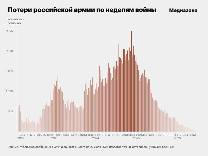
We see three peaks of increasing magnitude, in winters of 2022 (when the war started), and winters of 2023 and 2025. From December 2025 the numbers exhibit a decreasing trend. However, this is not necessarily evidence that the actual Russian casualties have been declining in 2026. It often takes literally years for death reports to percolate to the Mediazona database. So, how do we interpret this trend?
Fortunately (and thanks to them for this), the Mediazona team publishes not only the latest counts, but also what these counts were at different dates in the past. The data scientist in my team (Jakob) has downloaded these numbers, and in the rest of this post I will subject them to an analysis whose goal is to estimate the casualties curve by correcting it for the "recency" bias (the fact that it takes a long time to approach the true number).
The logic of the analysis is simple. Every week there is a true, but unknown number of casualties. Initially, the count for the week is well below this true level. But, gradually, reports on individual deaths accumulate on the internet. Not all of these reports are immediately seen by the team of volunteers at Mediazona, but the more time passes, the greater proportion of them are found and added to the database. As a result of this process, the weekly counts gradually increase, and become more stable. The more time has passed, the better is the estimate of the weekly casualties. The actual count will never reach the true level (which is only known to the Russian Ministry of Defense, and even those data have an uncertainty range associated with them). But when enough time has passed, the count changes at a low rate, thus giving us a reasonable estimate of the dynamics of the overall trajectory through the war - in which periods losses increase, when they decline, and by what percentage. In other words, our goal is to estimate relative numbers to assess the dynamics.
The model that I use is similar to the Logistic Equation (but not precisely, see below). The parameter K (carrying capacity in ecological applications) corresponds to the true casualty level for the week. With every new report, the weekly count grows towards this level. The rate of growth is proportional to the count at the previous update. Think about it this way. If K is, say 100, an early count may be 10, and it will grow in single units or tens. But if K is 1000, then the early number will be ten times larger, 100, and it will grow at 10 times the rate (10s and 100s).
Let us now trace the steps in the analysis.
Important note: I did the bulk of analysis over the weekend and while I don't think I made a conceptual or coding mistake, it is possible that I missed something. This is one of the reasons I describe my approach in some detail below. For less numerically minded readers, feel free to skip to the answer at the end. For those more steeped in statistical methods, feel free to point out any problems or outright errors - and I will do my best to correct them.
First, we need to visualize the data, as that helps a lot to avoid doing stupid things. Below, each curve represents weekly death counts, for each week when they occurred. This number is plotted against the "Report Day." Day 1 corresponding to 24-02-2022, the start of war, and Day 1590 is 02-07-2026, the latest update in the dataset I have. Each curve, thus, shows how a weekly count changes with time as information on that week's losses is updated.
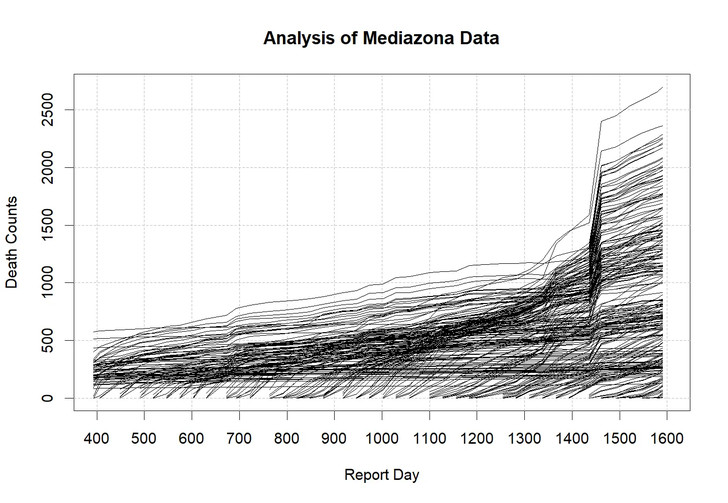
Eyeballing the data we immediately note a strong discontinuity between days 1436 and 1464 (from 29 January to 23 February). Between these dates, the overall total increased by 43,385 deaths, equal to 23.9% of the post-update total. Of that net increase, 24,182 deaths were assigned to 2024 and 12,268 to 2025. Mediazona explained this increase by a shift in the methodology - it had begun processing additional sources of information, such as accumulated missing-person notices, unit rosters, and other leaked records, verifying each death against state databases. As we shall see, this structural break will cause us some difficulties in the analysis and will need to be handled appropriately.
Next, we plot all trajectories by "Interval" - the length of time elapsing between the week when casualties occurred and subsequent reporting times.
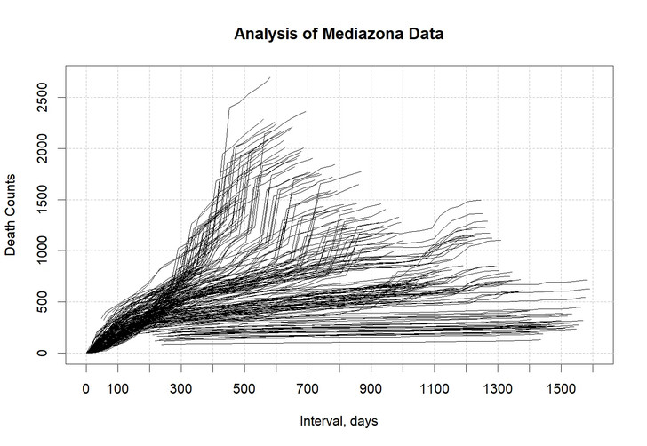
Here again the pesky February 2026 methodology change obscures the data-revealed patterns. So, let's look only at the trajectories before 02.26:
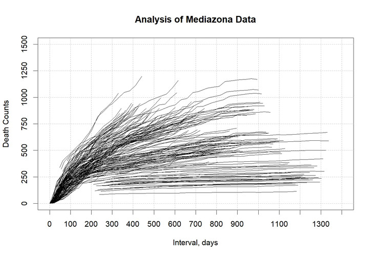
The pattern is now clear. It is indeed logistic-like (a technical note: but not exactly, as in the logistic curve the initial acceleration period is more prominent). Furthermore, the higher is the true weekly casualty (as indicated by the level where the curves are saturating), the more rapid is the initial growth rate. Thus, a shift to proportional rates of change seems indicated.
I estimate this relative change, which I call "delta," as follows. For each weekly loss, I first calculate how much the count increases between two subsequent report days. Next, I divide it by the number of days between the two reports, to express this change as a per-day rate. Next, I multiply it by 28 days (4 weeks), because this is the time step I will use later in the analysis. Finally, I divide it by the count at the previous report, to make it relative change.
What I have, then, is an estimate of the relative change per 28 days (relative to the starting point). This general approach is very similar to what I've used before in the analyses of population dynamics. Here's what these data look like when plotted against interval:
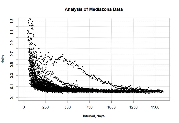
We expect that initial rates of change will be large (that's when weekly curves grow rapidly due to new reports), and then it should decline at higher intervals to nearly zero (as the pool of unknown deceased soldiers is gradually exhausted). Most of the data points follow this expectation, but there are two additional "streams" that clearly break out of this pattern.
One of these streams is due to the 02.26 methodological change. I mark all deltas for this period as red, to make sure. It turns out that the second stream refers to another date, the change between days 1338 and 1366 (November 2025). I mark these points as blue.
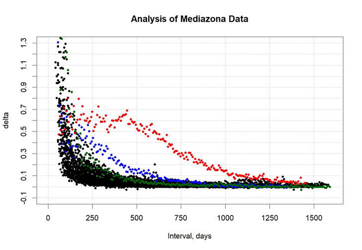
Indeed, the problematic dates are now clearly highlighted. In fact, let's scroll up to the very first analysis figure and, now armed with this insight, we see that there is a second structural break there, although not as extreme as the February 2026 one. If we eliminate the two problematic dates, we now see a very clear pattern:
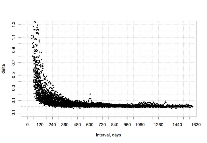
Here the broken line indicates the 0-level (and you can see that some updates are below it, reflecting corrections that remove incorrect names).
We are now ready to answer the question I started with, specifically, what has been happening with Russian casualties in 2026 - have they been increasing, staying approximately constant, or declining?
To answer this question, I use a technique known as "non-parametric bootstrap." We see in the graph above that (as expected) the magnitude of relative change declines with Interval. Rather than assuming a functional form to fit to these data, I will simply sample this cloud of points in the simulation, described below. There are two advantages to such non-parametric approach. First, I don't introduce any fitting errors, since I don't fit these data with a theoretical curve. Second, I don't assume a specific statistical model about how errors are distributed, because I sample from the actual empirical distribution.
The idea of the simulation is quite simple. Let's say that we have a most recent count (as of July 2, 2026) for the fatalities that occurred 6 months ago. In the months and years ahead this count will grow as a result of new information coming in. We simulate this process stochastically, by starting with current count. Then, every 28 days we add to it by drawing a random delta from the appropriate part of the curve (thus, starting with data at the interval of 168-196 days - where 6 months falls - and then moving to the right in 28-day steps). We run this calculation forward for 1590 days from the week when casualties happened (because this is the extent of our data set). At the end we have an estimate of what the "final" count for the week will be (actually, the count after 1590 days of finding new records and adding them to the database).
But this is just a single estimate, whereas we are interested in about how much uncertainty is associated with it. So, we repeat the procedure 1000 times, throw away the lowest 50 and the highest 50 values, thus obtaining a 90-percent interval. And we do it for every week in the data, from February 2022 to July 2026. This gives us the result we need.
Again, it's worth emphasizing that this is a preliminary report. I plan to release an updated result once I hear from colleagues and do some additional tests (for example, my analysis assume stationarity, but it's worth checking this assumption with a formal test).
With these caveats, here's the result:
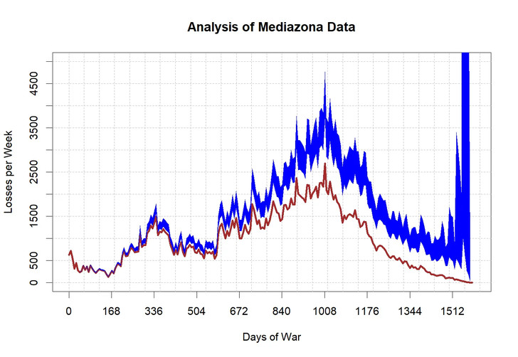
The solid (brown) curve is the actual weekly counts (as of July 2, 2026). The (blue) band shows the 90 percent uncertainty limits of the estimate what weekly counts will be after 1590 days (not quite the final numbers, but close enough). We observe that early in the war, the band is quite narrow and then gradually becomes wider. And then it blows up after Day 1512 (15-04-2026). At the very end, the uncertainty interval extends from 0 to a very high number off the graph - in other words, it could be anything.
Before that date, however, the trend is quite clear. Between the peak, which occurred on Day 1009 (28-11-24), and mid-April of 2026 the overall trend is down. This result seems to go against the hypothesis of catastrophic Russian losses in 2026 (at least, during the first 3.5 months of the year). If losses are catastrophic now, they were likely several times higher in Winter of 2025, and that doesn't seem credible, for a variety of reasons.
I invite comments and substantive critique. I know that this is a highly emotional subject - after all, hundreds of thousands of living beings were killed in this war. But on this Substack we will limit the discussion to the analytical issues (which I will ensure by banning the offenders if necessary).